
What I Learned Watching All of Webflow's Video Tutorials
40 video tutorials. One day. Here's what I learned watching 'em all!
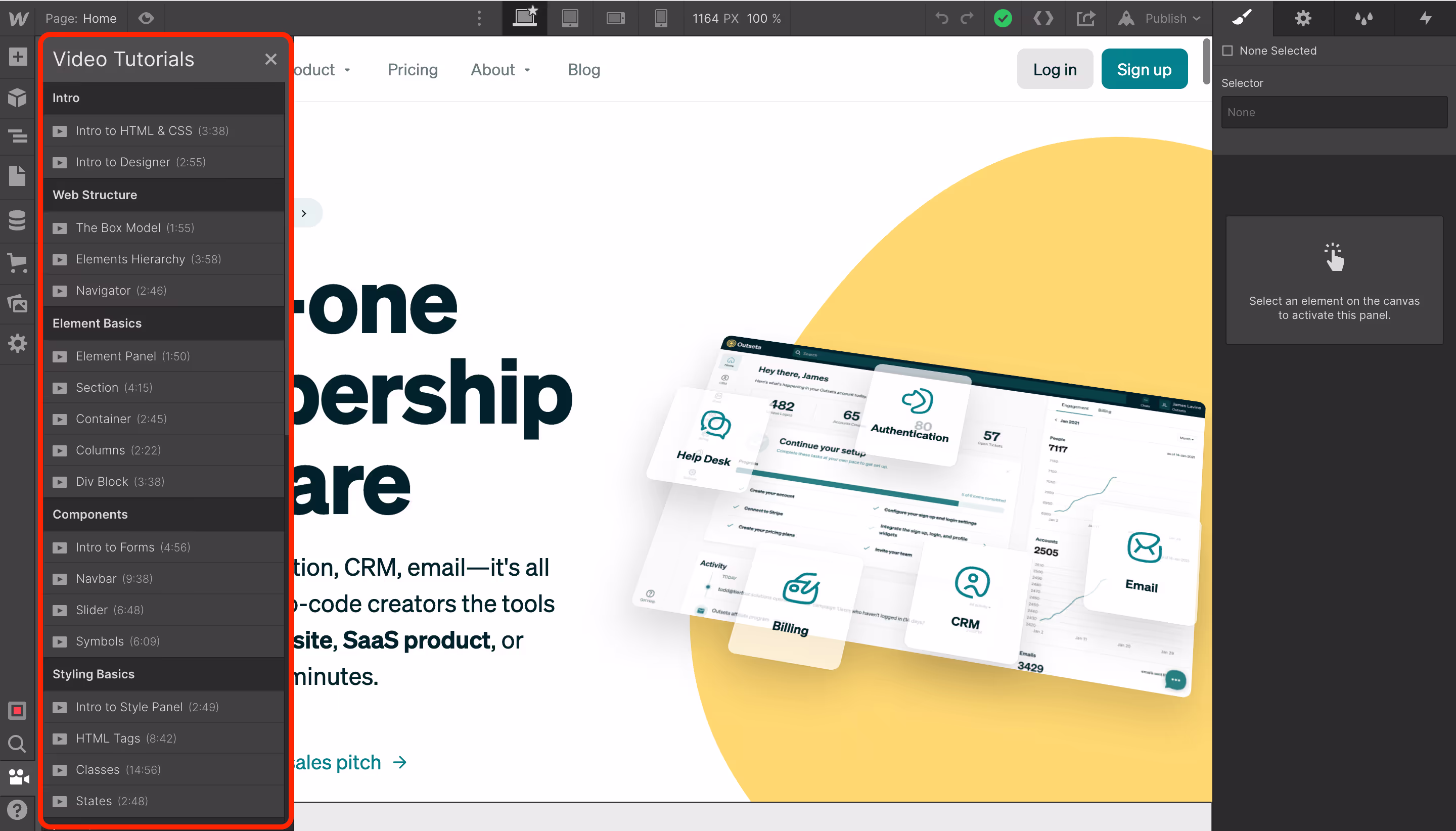
Earlier this week I did something I've been wanting to do for a long time—I watched all of Webflow's video tutorials. If you login to any Webflow account, you'll see a small camera icon in the bottom left hand corner of the screen. This links to a series of 40 tutorial videos that introduce how to work with Webflow. These videos are regularly lauded as the gold standard for tutorial videos—rightfully so. They are informative, funny, and the production quality is just crazy good.
I took me all day—about 6 hours—to watch all of the videos and really digest the content. By the end of the day, I was fried. Watching the videos mostly confirmed what I already knew about Webflow—this post will share both my raw notes and high level learnings. I hope this post is helpful to other builders who are trying to get up to speed on Webflow!
I'm a marketer learning Webflow
Before I dive into sharing what I learned, it's important to have some context on my own skill set—this will give you a sense of the lens through which I've experienced Webflow.
I've already been using Webflow for quite some time
When we first started building Outseta 5 years ago, I built the first version of our website on Squarespace. I chose Squarespace very specifically because I knew that it would allow me as a relatively non-technical marketer to build an attractive looking website without bothering our development team. I wanted to be self sufficient, and Squarespace provided that.
However, I later decided to migrate our website to Webflow. As Outseta grew up, we hit some limitations with Squarespace and I knew we needed a website with better performance and fewer limitations. You can read more about that decision here. For the last 18 months or so, I've been managing our own website on Webflow and have learned a good deal about the product through trial and error. Outseta's website aside, I spend most of my days logging into our customers' websites and helping them bring new sites to life with Outseta and Webflow.
The point being, I'm not totally new to this!
I'm first and foremost a marketer
Like most start-up founders, I wear many hats—but I will always self-describe as a marketer. I don't write code whatsoever and I have no formal training in design. It's worth mention that I have a pretty strong understanding of user experience design—I can create a mean mock-up and generally have a good sense what a good user experience looks like. As many marketers do, I look at designs heavily through the lens of their ability to drive "conversions" or at least to get the user through a specific task successfully. But when it comes to the fundamentals of creating pixel perfect designs myself, my own skill set it quite weak.
I self describe as relatively non-technical
The terms "non-technical" and "no-code" can both be a bit problematic, as ultimately they're relative and not very specific. I self describe as relatively non-technical, so let me further explain what I mean by that.
Webflow has latched on to the phrase "no-code," and it's accurate in the sense that you don't need to know how to write code to build sites in Webflow. I don't write code—I guess that makes me a "no-coder." Without question, tools like Webflow and Outseta have given me the ability to build all sorts of websites and products that I never could have imagined just a few years ago. That's pretty amazing.
But the phrase "no-code" is often misleading—it's too often interpreted as "anyone can do this without any technical skills." No-code is a blessing in the sense that it enables many people to build products in a way that they couldn't before, but it's also a curse in that it often leads non-technical people to try to build stuff without any understanding of fundamental concepts that are really needed to be successful.
In many ways, I am technical—I work with software all day long. I've built websites before. Heck, I'm building a software company! I'm certainly more comfortable than most as a user of technology, but both coding and design are areas where I have no formal training.
I mention this context up front because if you're a designer or a developer you'll likely feel very comfortable in Webflow quite quickly. But it you're a no-coder without those skill sets, there's a significant learning curve. My hope is this post accelerates your own learning as you dive into the Wonderful World of Webflow.
Let's start with my major takeaways having watched all of the tutorial videos!
Code? No. Design? Yes.
Let me state this very directly—you don't need to know how to write code to use Webflow. But the flip side of that is if you don't have a background in design, you're going to struggle—you basically need to learn the fundamentals of design to be successful.
Without question, Webflow is a website builder built for designers.
This has definitely been reinforced by our own team's use of Webflow. I've learned quite a bit through trial and error, but Webflow is still overwhelming to me at times. Contrast that with James our design lead—James had never used Webflow before he built our site on the platform, and while he had to familiarize himself with the designer he was comfortable in Webflow very quickly. All of which is to say I think the term "no-code" can often create a false sense of security that leads to many users without a background in design struggling when they first start out.
This is not a knock on Webflow—it's an important point to consider as your evaluate website platforms. There is enormous benefit to Webflow making designers self sufficient, without requiring reliance on a developer. I started my career building websites on Wordpress, and have led countless website projects where I hired both a designer and a developer to build websites. Webflow has completely cut out the need for a developer, which previously was far and away the most expensive aspect of building a website. And even in the context of our team today, it means that James is self reliant when working on our website and doesn't need to pull our developers in to help with site updates. That alone is huge!
The designer is an amazing tool
Perhaps my biggest takeaway from watching all of the tutorial videos in their totality was how powerful the Webflow designer is—I was left with the impression that you can create almost any design you can dream up in Webflow. While I suspected this before, I simply hadn't been exposed to the full breadth of features and all the different ways the designer can be leveraged. It's pretty amazing the see firsthand.
This sentiment reflects why designers love Webflow so much—it gives them massive amount of control and the freedom to bring their ideas to life. It also struck me that the designer itself is almost being undersold as just a tool for designing websites—I could see it being leveraged to design all kinds of front-end, digital experiences.
It's worth note that I was also left with a strong sense that Webflow provides almost too much control for someone like me. The feature set has so much depth and opens up so many possibilities that I feel like I'll never be able to learn or fully take advantage of half of it.
I feel more comfortable, but not necessarily more capable
Without question one of the benefits of watching all the tutorials is I already feel more comfortable in the product. I better understand it's layout, it's terminology, and generally more of what it's capable of. This benefit is hard to quantify, but the tool feeling more familiar is definitely a good thing.
While that's the case, I don't really feel like I'm suddenly more capable in the product. The tutorials helped me understand the feature set at a conceptual level, but the real learning comes from knowing how and when to leverage each feature. As with most things, I think that can only really come with experience. One thing the video tutorials do extremely well is share real world examples of how each feature is used—for example, things like using "sticky" positioning for a nav bar.
Learning Webflow is at least a starting point to learning the fundamentals of design
I felt like most of what I learned by watching the video tutorials had to do with learning the fundamentals of design than learning Webflow specifically. I'm sure any designer that's reading this is unimpressed with my feedback, as this stuff is rudimentary to them. But that's exactly my point—as a marketer without a design background, these are the things that make learning Webflow somewhat daunting. Just as a developer might scoff at a designer who doesn't understand their code, a designer can scoff at me for not understanding some of these concepts. But I think it's an important point that you're not really going to learn Webflow unless you first learn the fundamentals of design.
Like anything, there's a time and place for any tool. I get asked constantly my no-coders for recommendation on which website builder they should use. My overarching feedback is:
- If you're a designer or need to build a high performance B2B website, use Webflow.
- If you need to quickly spin up a landing page or MVP style website, use Carrd.
- If you're truly non-technical, build your site with Squarespace.
- If you love Salesforce, use Wordpress.
Here are some of the design concepts I struggled a bit to grasp.
Sections vs. Containers vs. Divs
I was hoping to come out of watching the tutorials with a better sense of the difference between Sections, Containers, and Divs—and when to use each. I understand that these are ways of organizing content on a page—containers bound your content within a section, and divs often live within containers acting as a further...container?... for your content?
I understand that this is largely a matter of hierarchy and also dictates some rules of how styles are applied, but I didn't leave with a strong understanding of when to leverage each. This was something I was hoping to get out of the tutorials going in—one of the most common issues I'm asked to help troubleshoot on Webflow sites is when a class or custom attribute is applied to the wrong element, section, container, or div. I see this constantly, usually by mistake. I know how to identify and fix those issues, but I still feel a little uncertain in terms of things like when I need to use a container versus a div.
Classes can easily create headaches. Where'd you get your style from?
I've long understood that CSS classes allow you to define a common styles in a way that is reusable—applying a class to an element will give it predefined styling so you don't need to style every element individually. This is obviously a huge time saver as well as a key to delivering consistent designs.
That said, as a noob to design knowing how and when to use all the different types of classes is a lot to take in. There's regular classes, combo classes, global classes, and body (all pages) HTML tags that all offer a means of applying defined styles. Beyond understanding which one to use in any given situation, these different classes often override each other which can make it tough to understand what's actually applying styling to any individual element on a page. Webflow provides some visual indicators to help sort this out, but this is another area where it's really easy to get tripped up—or to just spiral out of control with class chaos—if you're not pretty fluent in CSS.
Class chaos is real, just as SaaS chaos is real!
Below you'll find my raw, unedited notes—this is what I jotted down as I watched each of the videos specifically.
My notes from each of Webflow's tutorial videos
The notes that you find below are what I jotted down after watching each of Webflow's video tutorials. They are in sequential order and I've added a bit of commentary after each section. This is very much my stream-of-consciousness as I watched each video.
Intro
Intro to HTML & CSS
- HTML is used to deliver content—headings, text, images, links.
- CSS is used to style content—it allows you to define styles that can be reused so you don’t need to style each element on a page individually.
I knew going in that a basic understanding of HTML and CSS is really needed to use Webflow successfully, so I wasn't surprised that the tutorials started by introducing these concepts. How both are introduced mirrored my own understanding of each. While I know the very little HTML or CSS, all of the good designers I've worked with are fluent in both.
Intro to designer
- In the left hand navigation the designer provides links to add elements, edit pages, edit CMS items, or manage assets.
- The "canvas" is where you edit / manipulate all the content on a page. It uses the “box” model, which means content is added to the page in boxes. The content fits the size of the box automatically unless otherwise specified.
- The panel in the right hand sidebar provides control over individual elements on page.
This is helpful context in getting your bearings in the designer.
Web Structure
The box model
- All elements on a page live within a box—think of them as having borders around them.
- This is helpful in developing responsive websites, as you can define how the boxes rearrange themselves based on screen size.
- Boxes can also live within other boxes—applying styling to a box that contains other boxes allows you to apply styles to the boxes within it.
I had a basic understanding of the box model going in, but this was helpful in learning how styling can be inherited based on the box content is in.
Elements Hierarchy
- Nesting is putting one element inside another.
- Body is typically the “parent” element. It will have various “sections” which are its "child" elements.
- Text styling—”children” can override the typography they inherit from their parent element.
- Sizing—the size of a parent element is determined by what’s inside of it.
This is all pretty logical—I've always thought of the "body" as the main content on a page, then we're just breaking that down into "sections."
Navigator
- Anything you select from the navigator (the right hand side bar) is the same as selecting the element on the canvas itself.
- From a hierarchy perspective, each child element is indented in the navigator from its parent. This relationship can continue on for as many levels as needed.
- Movement—you can use the navigator to drag and drop entire sections on a page into a different order.
This was really useful for me. I'd always selected elements directly on the canvas rather than using the navigator. I can now see how the navigator is really useful in selecting a very specific element on the page.
Element Basics
Element Panel
- You can click on an element on the canvas, then click to add an element. This will add the new element immediately beneath the element you selected on the page.
- You can also drag and drop elements onto the page—the navigator will show you exactly where you are dropping the element from a hierarchy perspective.
- You can also drag and drop elements directly into the navigator.
Good to know but not sure that this will change my own behavior. I've always just dragged and dropped elements onto the page. Something about making those changes visually appeals to me over relying on the hierarchy and relationships shown in the navigator.
Section
- A section is—for lack of a better word—a section of content on the page. Think of this as a big portion / block of content. By default, a section will take up 100% of the width of a page. Sections stack on top of one another to organize our content.
- A “container” sets a maximum width for content within a section.
- “Combo Classes” are new CSS classes that use an existing class as a starting point for modifications.
- Viewport height—I think this is how much of the page you can view at any point in time? 50% would be half of the page, 200% would be double the viewable page.
I learned what a combo class is in this section. I understand the relationship between a section and a container, but it's not immediately apparent to me why both are necessary aside from just a level of hierarchy. For example, why not put content directly into a "section" and then add padding on the sides? What's the benefit to using a "container" over this approach?
Container
- A “container” bounds all of the content within it to a defined area.
- Containers can be saved / reused as “classes.”
- It’s generally a good practice to have a container inside of each section.
Columns
- Columns allow us to place content side by side (horizontally).
- Select the “columns” element, drag into onto a page, then choose the layout (how many columns you want to display). Then add your content.
- It’s a good practice to create “classes” that you can then apply to your columns as well.
Div Block
- Div block is another way to organize your content—a section is the top level with a container typically living within a section. A div block typically lives within a container.
- A div block becomes the parent element of all elements you put inside of it.
- Try not to use div blocks as spacers—try to add padding to elements instead.
Back to my previous comments—I understand the difference between sections, containers, and divs from a theoretical perspective, but what's not entirely clear to me is when you would use each in practice. I suspect that will only really come with experience.
Components
Intro to forms
- Start by adding a form block element to the canvas.
- The form wrapper contains 3 elements—the form, success message, and error message.
- Placeholder is text that displays in the form field prior to the user entering content into the field.
- Autofocus option will put a blinking cursor into one the form fields indicating it’s the starting point for completing the form.
- Go to PROJECT SETTINGS > FORMS to specify what happens when a form is submitted successfully. Typically submission details are sent to someone via email.
Webflow offers a really nice form building tool. Maybe we should make Outseta's sign-up and login forms compatible with Webflow forms?
Nav bar
- Start by dragging a nav bar element inside the body element of the page.
- The “Brand Link” element inside of the navbar is where you add your logo.
- “Nav menu” contains navigation links to different pages.
- Create a class for all of your nav links.
- You can set which devices you want to show a hamburger menu on.
- Select your nav bar, right click on “Nav bar,” and click “Add Symbol.” Symbols allow you to reuse components like a nav bar.
This video was really clear and informative on how to build nav bars.
Slider
- Used for adding something like a carousel of images to a page.
- Slides live within “Mask.”
- Can add any elements / content you like directly to a slide.
Symbols
- Symbols make any element reusable.
- Symbols are called out in green. If you make a change to a symbol, the change is reflected everywhere the symbol is used.
- If you create “override fields” you can override any images / text / etc within a symbol.
I was basically unaware of symbols prior to watching these videos—I'd seen them in Webflow and wondered "what is that?" They are basically just reusable elements with predefined styles.
Styling Basics
Intro to style panel
- Orange indicators—style is being inherited. Blue indicators—style is coming from current class or tag.
I was totally unaware of this—I don't think I ever even noticed it within the designer. I'm not sure that practically I'll use this much... classes overriding classes hurts my head.
HTML tags
- Tags represent a starting point for a large number of elements.
- The “Body (all pages)” tag can be used to set defaults for things like typography, background color, etc. These are starting points that can be overridden with classes.
- You can set tags for things like “All H1s” or “All paragraphs” or “All links.” If a class is not present, then styling will default to these tags next.
I know this is basic HTML and CSS stuff, but as someone new this this I'm kinda like "why are tags setting styles when that's what classes are for?" This has nothing to do with Webflow specifically, but was my reaction to learning about the Body (all pages) tag.
Classes
- Set styling once, then apply it to all other elements that have that class.
- To create a class click on an element, go to the “Selector” field, then name the class—that’s it.
- Combo classes allow you to inherit the styling from a class, but make further changes to the styling. All a combo class does is override the base class adding more specific styles.
- Duplicating a class completely breaks the relationship between the original class and the new class. Combo classes still inherit and update based on the base class, they just allow for further modifications in styling.
- “Global classes” can be used to set styles that aren’t already set by another class. You can select any element and apply a global class to it. If your global class contains a background image, it can only be applied to elements that don’t already have a background image set.
Immediately understand why classes are useful and time saving (you don't need to style each individual element) as well as how the role they plan in delivering consistent designs. How and when to use classes, combo classes, duplicate classes, and global classes is certainly easy enough to understand at a theoretical level, but putting it into practice effectively seems daunting.
States
- States are different visual indications that update when a button / link is hovered over, pressed, or used to highlight focus on a specific field.
- Hover - Can be used to change a button’s color when it’s hovered over.
- Pressed - Can be used to change a button’s color when it’s clicked.
- Focused - Can be used to show focus on a specific form field when you put your cursor into the field.
This is cool—these are the little design details that not only help the user, but also just add such a nice level of polish to a site.
Layout
Intro to web layout
No notes here.
Spacing
- Padding—the space inside an element.
- Margin—the space outside an element.
- Automargin can be used to automatically center content horizontally on a page.
- Adding “Negative margin” values is useful in creating designs where one element overlaps another.
This all makes sense. Knowing how much padding and margin to add really comes down to experience / having a designer's eye.
Display Settings
- Block - Elements take up the full width of the parent element, knocking down other stuff the the next line.
- Flexbox - Typically set at the parent element to align all elements within it vertically or horizontally. The parent element sets the rules, children follow them.
- Grid—Each element takes up it’s own box on the grid.
- Inline Block—Element wrap to the next line when they hit the edge of their container.
- Inline—Can be used to visually call out text within a block of text that’s otherwise similar.
This is probably the single area of all the video tutorials I struggled with most. Again, this stuff isn't hard to understand at a conceptual level but how / when to use each of these display settings is still mostly a mystery to me.
Intro to Flexbox
- Start by selecting the parent element. Use this to align / justify to center content.
I get that flexbox is a big deal and that align and justify are useful in centering content, still just unclear on when I have an obvious need for a flexbox.
Grid
- Elements added to a grid are automatically positioned and automatically wrap.
- Click “Manual” if you want to drag and drop elements within a grid.
- Grid blocks aren’t actual containers—use div blocks within the grid for your elements.
- Use “Fit - fill” to make sure elements of different sizes fill each section of your grid.
I understand how this can be leveraged to position content in a grid format. But if grid blocks aren't actual containers, what are they? Just a framework for holding containers (divs)? Again I think this all comes down to hierarchy and the rules of how classes get applied to sections / containers / divs—but that's clearly one of the concepts I'm struggling to make use of practically.
Position
- Static—How elements are positioned on a page and relative to one another by default. Elements are added to the top left of their container and subsequent elements are positioned below them.
- Relative—Allows you to drag / drop elements and have them show up behind or in front of other elements using the z-axis. Useful for creating collages. Use the “z-index” and input values of 1,2, etc with the higher values stacking on top of the lower values.
- Absolute—Sets a standard position for an element on a page. Position things around other elements.
- Fixed—Fixes the position of an element even when someone scrolls. Think of a live chat widget, banners, etc.
- Sticky—User for things like a navbar. You need to define how far you can scroll before the element sticks in its place.
- Floats and clears—Floats make other elements (below them in the navigator) wrap around them.
I'd always kind of wondered why when you add an element (like a button) to a page in Webflow it's always positioned all the way at the top left hand border of the page—"static" explains that. "Relative" positioning is kind of a mind-blowing thing to me—I never even considered how to do that from a design perspective—I sort of just imagined one image was cropped / cut off by another rather than thinking about the images being layered on the z-axis. This stuff is cool and immediately useful to me—for some reason I can grasp and apply the positioning stuff more easily than the display settings.
Responsive Design
Responsive Design
- You can predefine the size of any element, or relative sizing dictates the size of an element relative to its parent element. This leverages percentages rather than pixels.
- Breakpoints are based on the width of the viewport—they allow you to modify a design based on the viewport size collapsing or expanding.
Intro to Webflow Breakpoints
- Any styling changes you make on your base breakpoint (standard screensize) will be reflected by default on both larger and smaller screen sizes.
- If you reduce text size or number of columns in a grid for a smaller device, all small screen sized will inherit that change. Same is true of similar changes for larger screens.
In all the tutorials responsive design is probably the area I was most familiar with going in. Nothing earth shattering here and the concept of breakpoints makes perfect sense to me. One thing I wasn't totally clear on—say you reduce the size of some font for smaller device sizes. Because the text was made smaller specifically, does that mean all smaller screen sizes automatically inherit that change (but larger screen sizes don't)? Is it simply that any changes made to a smaller screen size automatically affect all of the screens sizes that are even smaller than it (and vice versa)? I think so, but I'm not totally sure.
CMS and Dynamic Content
Intro to Dynamic Content
- Dynamic content—Content is built out automatically leveraging your design. No need to update things manually item by item.
This was introduced a bit differently than I expected—"content is built out automatically leveraging your design" sounds like some sort of magic to me. I guess I think of dynamic content / CMS collections more as just a templated design that gets reused for blog posts, profile pages, etc.
Intro to Webflow CMS
- Collections are top level organization of dynamic content. Within collections are items, items have fields.
- Collections contain items that can be pulled into collection lists (that can be pulled into any page) or they can be their own collection pages (stand alone pages for each item).
CMS Collections
Didn't take any notes here—I work with CMS collections a lot so none of this was new to me.
Collection Lists
- Used as a sort of organizational grid for CMS items. It’s an element type itself if you want to add a collection list to a page.
- You can drag elements (Headers, Images, etc) into a collection list and “Bind” them to your CMS collections to pull in the Header, Image, etc associated with each collection item.
- Collection lists settings allow you to set rules on how collection list items are displayed.
I've spent a lot of time working with collection pages, but not much with collection lists. This is a useful feature to familiarize myself with more.
Filtering Collection Lists
- Used to filter which collection lists item display based on categories or other rules you set.
So is Jetboost simply offering much more sophisticated filtering and sorting options for collection lists? In addition to favoriting, etc.
Collection Page
- Don’t understand the “binding” piece.
I get it conceptually, but I think the tutorials kind of skipped over the notion of binding more than they should have.
Intro to the editor
- You can control which elements on a page can be edited by an editor.
- If you edit a collection and click “Draft” you can publish any additional changes made to the site without publishing the collection item that’s in draft mode.
CMS Collection Fields
- Plain text field—A block of unformatted text to use in an element. It will inherit the styling of the element itself.
- Rich text field—Use for long form content or when editors needs to have the ability to format content.
- Image field—An image!
- Number field—Helpful in setting up sorting and filters based on a numeric value.
- Switch fields—Use to filter based on something binary—yes or no, featured post or not. Can also be used to set conditional visibility based on the switch—for example, only show this form on a page if they switch is yes, hide the form if the switch is no.
- Reference fields—Allows us to reference fields from an item in another collection. For example, you could create a collection for “Authors” and then reference this on your “Blog Posts” collection so that you can select an “Author” for each of your blog posts.
- Multi-reference field—Pick / reference multiple items from another collection. Think of having multiple tags or contributors on a single blog post.
This was really helpful. This made the use cases for reference fields and multi-reference fields in particular much more clear to me.
Welp, that was a look inside my brain as I embarked on learning Webflow with some rigor beyond just trial and error. I'm looking forward to learning that much more!
Want to learn more about using Outseta and Webflow together?
Try Outseta free for 7 days—you'll have access to every feature. Cancel any time.

On this page
Get our newsletter